
Litespeed Titanium Bicycles Branding
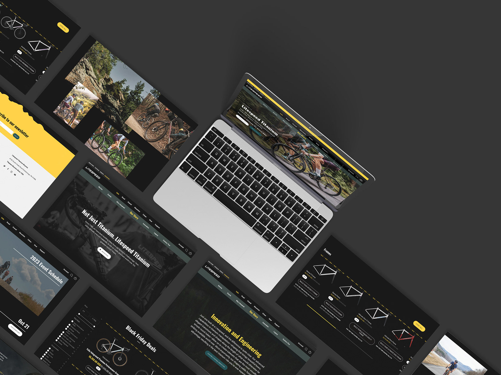
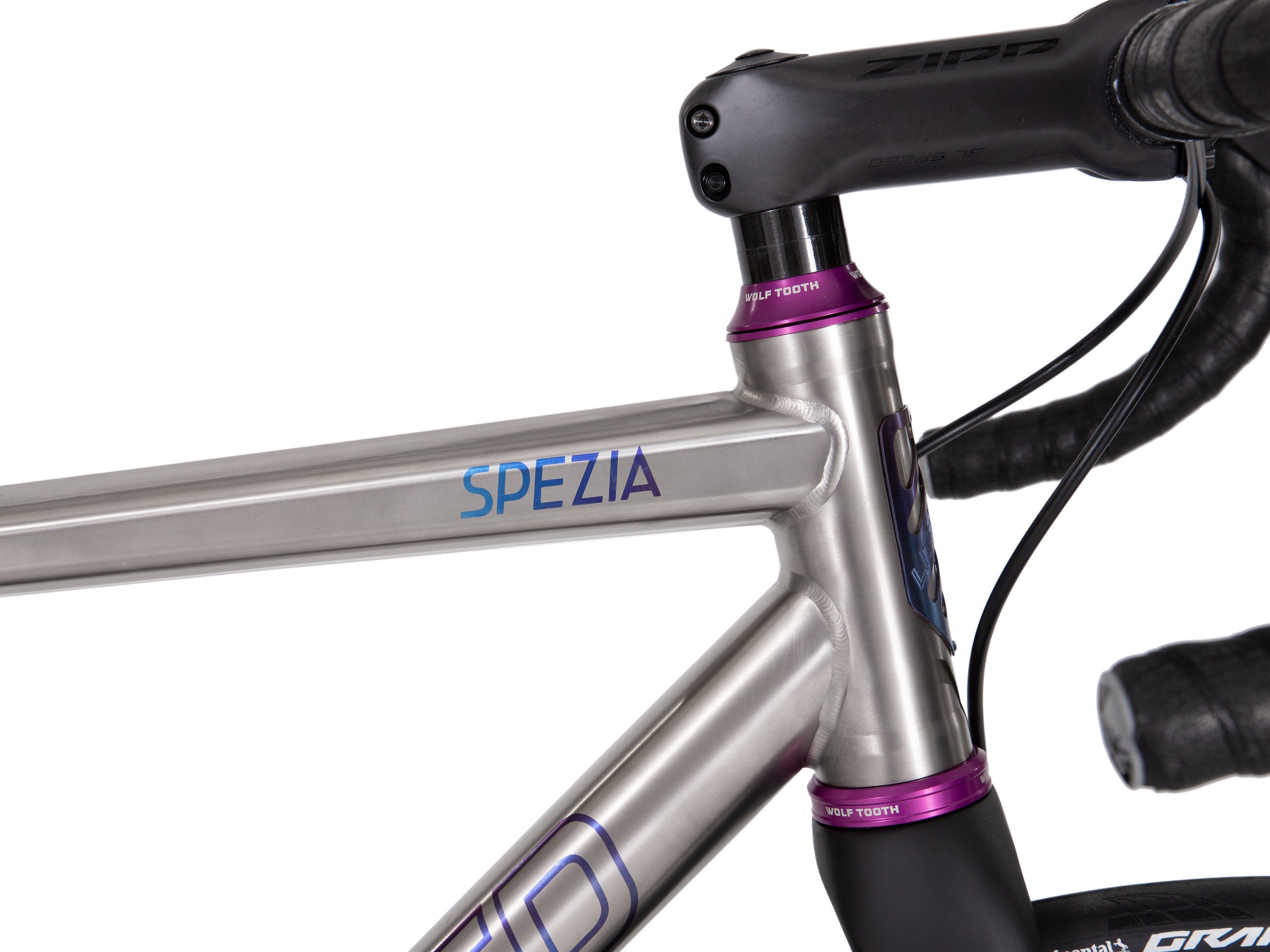
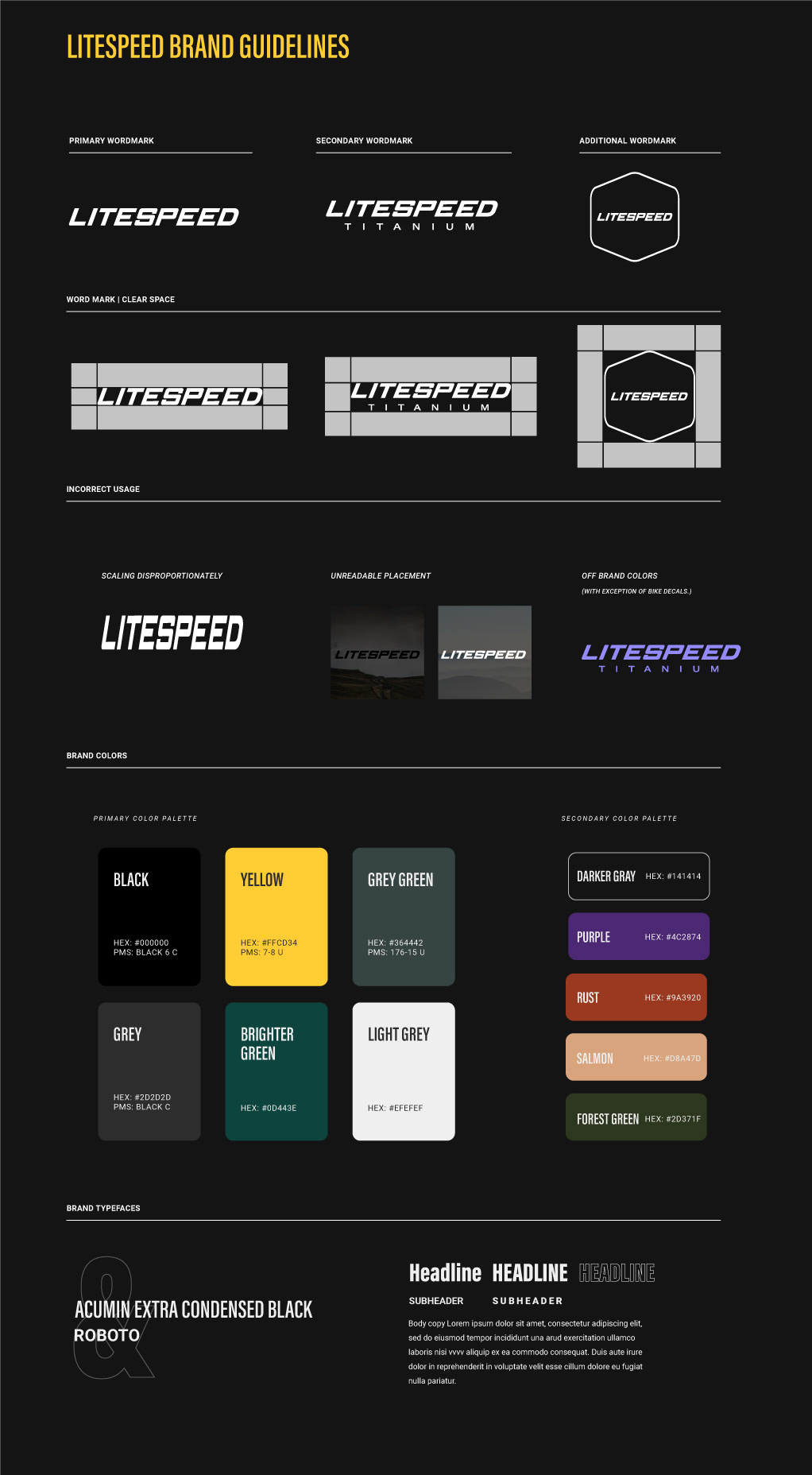
I recently redesigned the Litespeed Titanium Bicycles website. During that project, the necessity of tightening up the brand became apparent. After researching the existing brand and its history, I selected new colors and designed new typography applications to the freshen up the brand, and give the marketing team both freedom and clear guidelines for use. The desired tone was a combination of performance and joy using these high-end bicycles. I also expanded the brand's existing icons, which are utilized primarily on the new website, and are crafted for email and social media designs.
OBED Bikes Branding
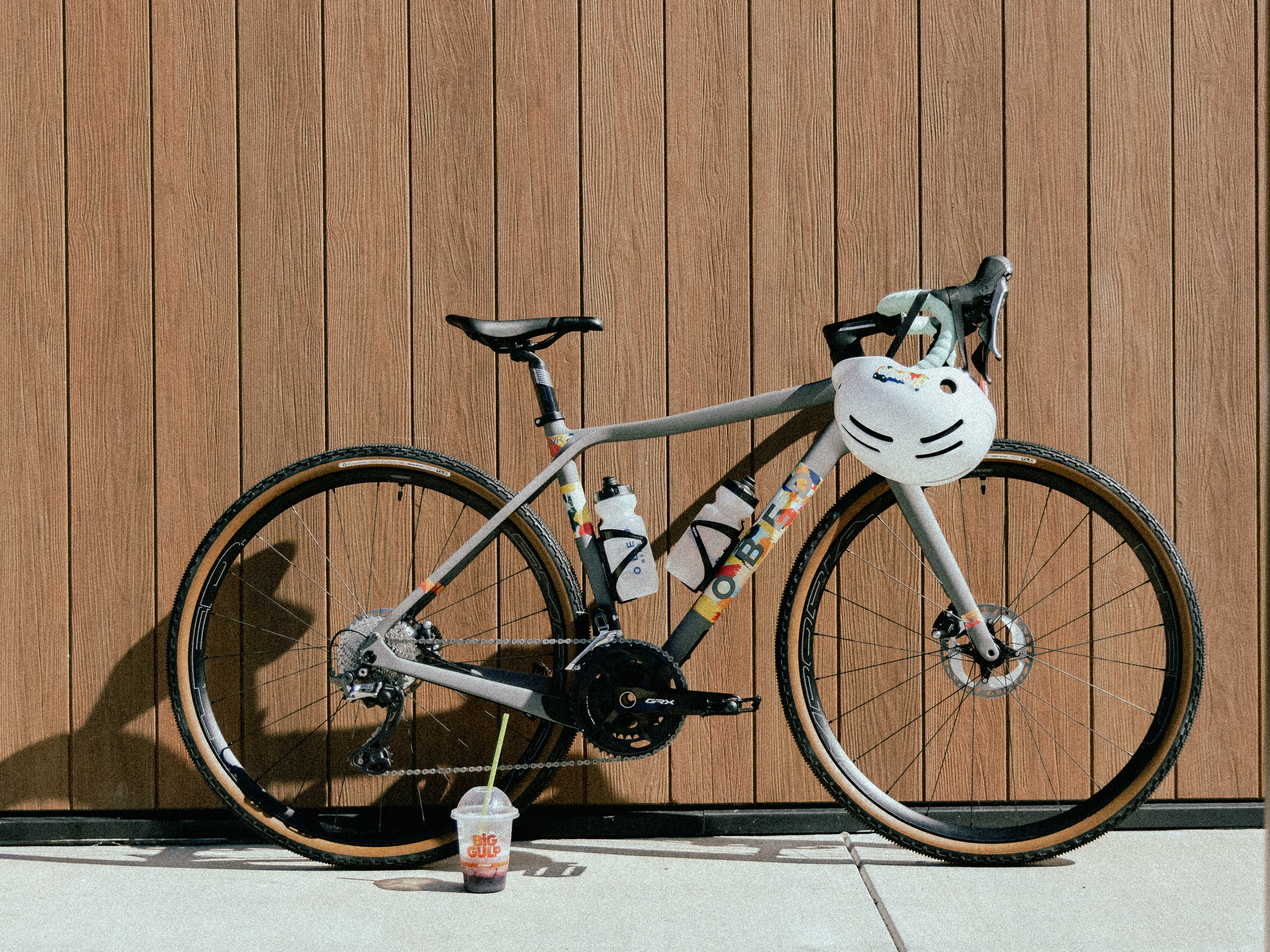
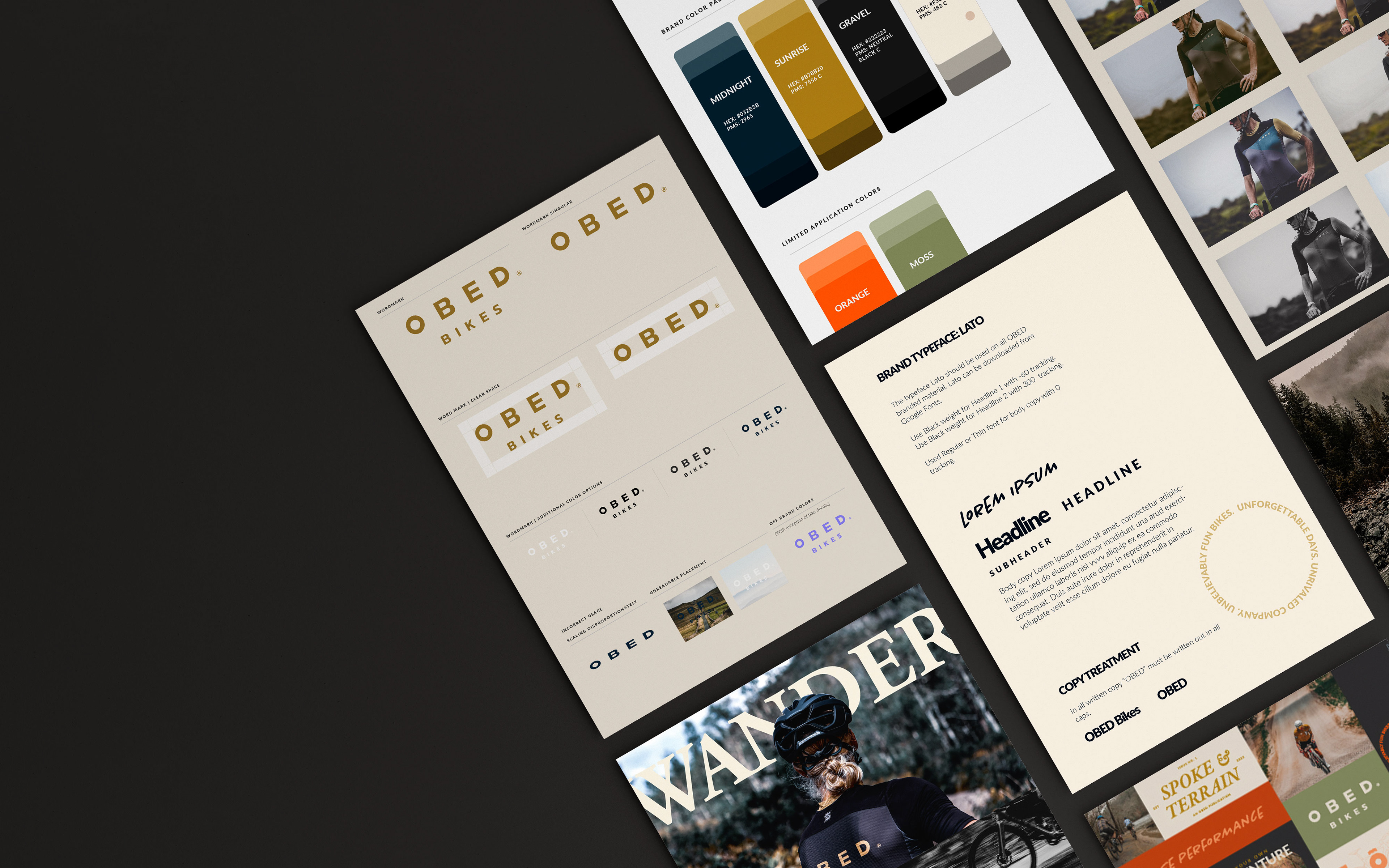
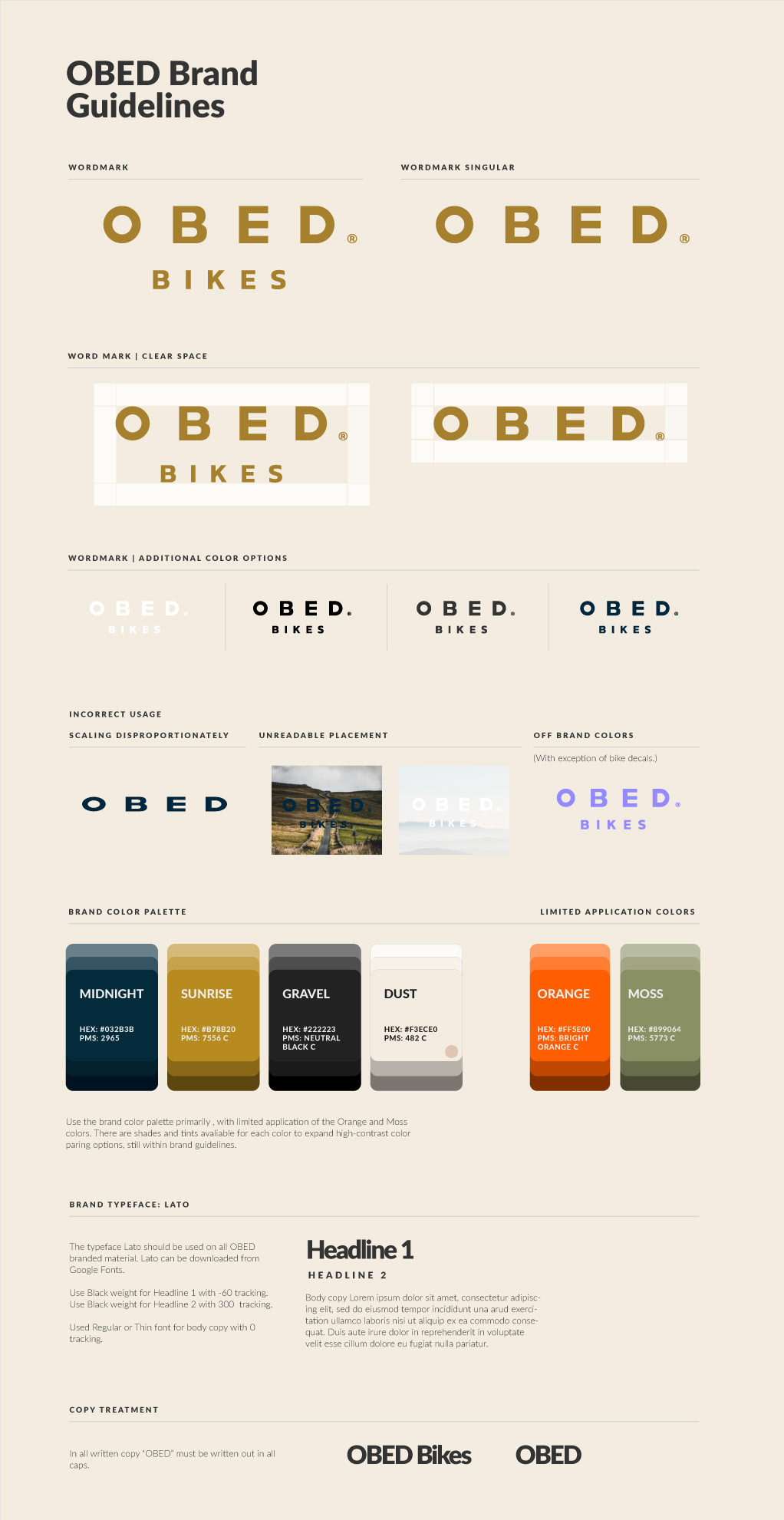
During the creation of the OBED Bikes gravel magazine, Spoke & Terrain, I realized that this was an opportunity to expand upon the existing branding and give it an updated, exciting look. I included more interesting color sections, with higher contrast for better visibility. I also created photo editing presets to increase drama, and give it the high-end editorial look I was going for. The magazine was a huge success and allowed me to pull in the updated assets into the standard brand guidelines. These updates allowed for greater success on marketing projects and better customer-facing presentation of the brand. 
Quintana Roo Branding
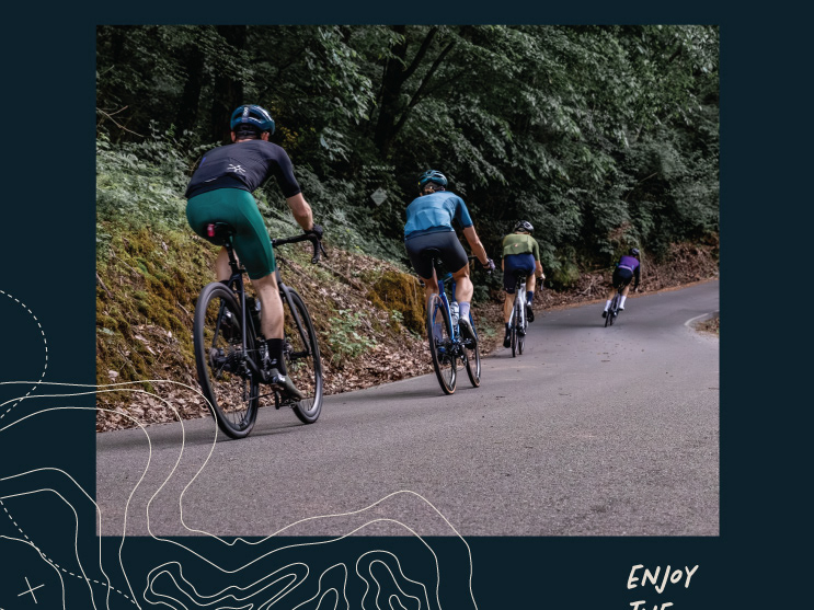
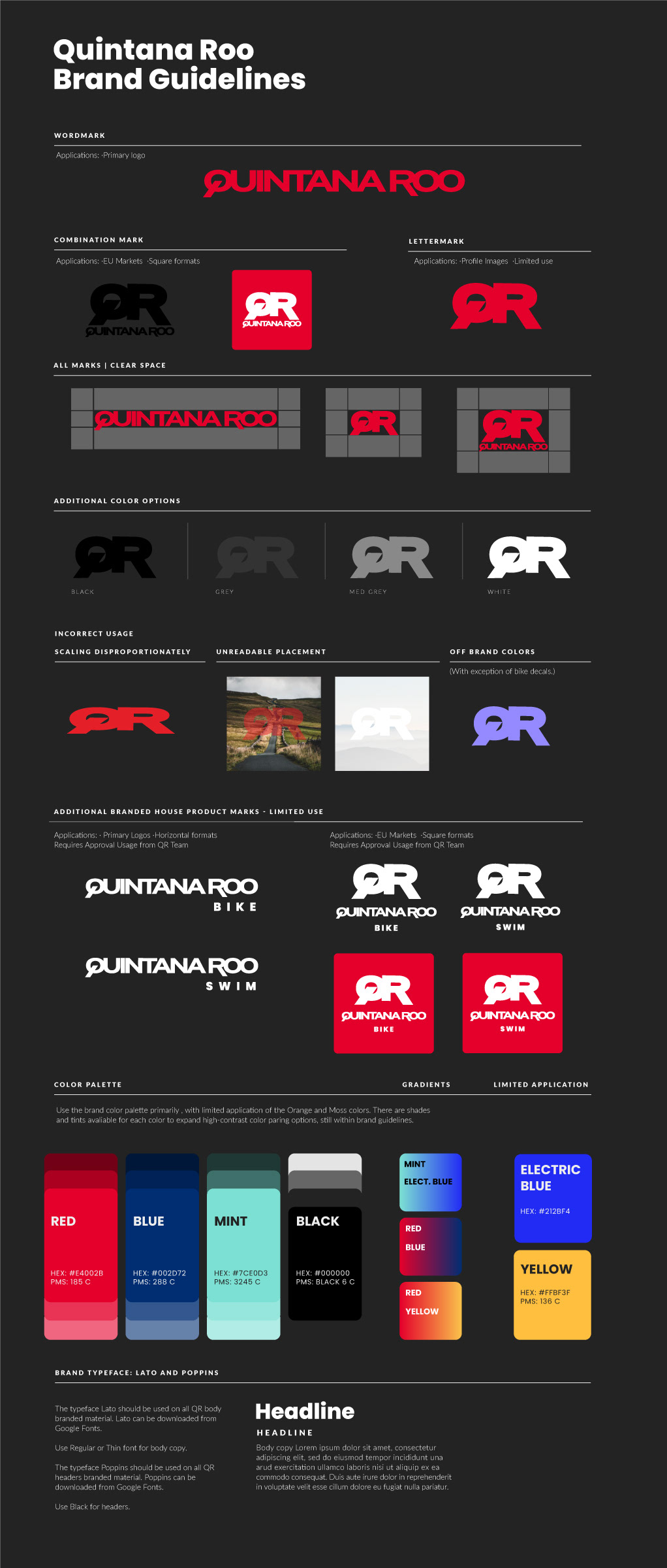
While the Quintana Roo brand had the most updated guidelines of the three brands under ABG, there was still a need for more updated look. I updated the color sections with what I knew to be more eye-catching to triathletes and cyclists, knowing this could apply across all customer-facing presentation of the brand. I also expanded the typography and image editing techniques, to give a cleaner, more high-end look with thinner line weights and more intentional type placement. Overall ads have done really well with these updates and sales have been up more in 2024 than they have in the past five years.

You may also like

Back to Top